
NEW from the Tether Tips Blog – Year on Year Trend Reports – A How to Guide
A really helpful tip from one of our Salesforce Lead Consultants – Mark Hanaway this week.
Introduction:
With your Companys Sales data for the previous couple of years sorted and stored in Salesforce, why not use this feature to help you predict the highs and lows for the Coming Fiscal year?
A joined report consists of up to five report blocks, which you add to the report to create multiple views of your data. For each block, you can add regular and summary fields, create standard and cross-block custom summary formulas, apply filters, and sort columns. You apply groupings across all blocks in the report, and can add up to three groupings to the blocks, the same as for the summary format. You can also add a chart to a joined report.
With a Salesforce Joined report you can display year on year data, by following these simple steps.
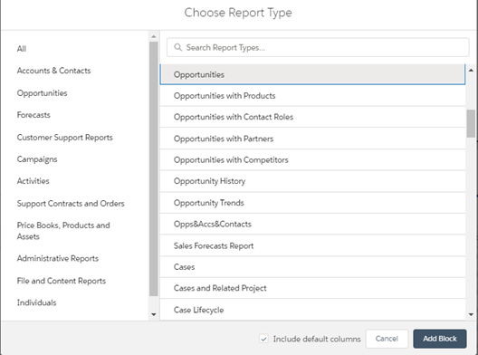
- Navigate to your reports tab and select the report type you wish to use in your report.
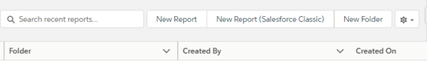
Select “New report” on the top bar, and then choose the Report type from the drop down below.
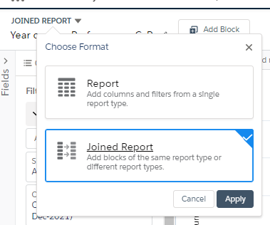
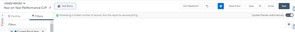
2. Change your report from a Summary to a Joined Report by selecting the drop down above the name of your Report.
3.Add a new block to your report for every year you wish to include in your report. Note: Don’t forget to name your blocks.
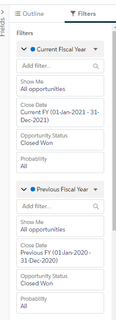
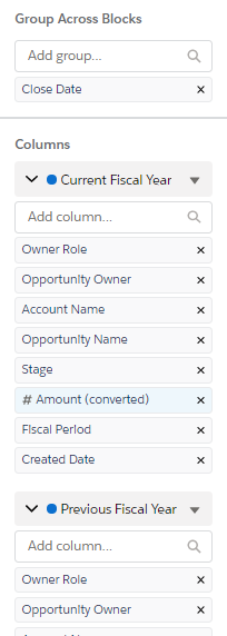
4. Once you have enough blocks created, you need to set your filters, Groupings, and columns to show the respective data you wish to see.
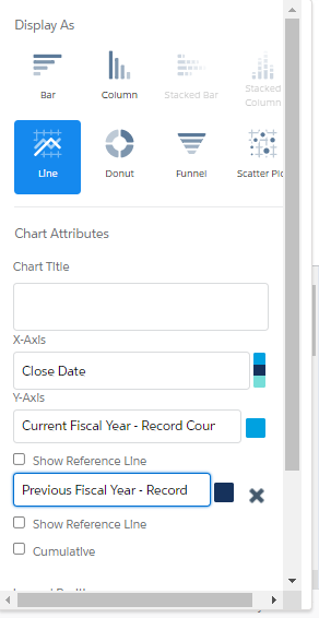
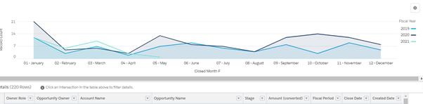
5. After all your configuration work has been completed on your report the next step is to select your chart style. I prefer the Line chart as it overlays the years in your report. This way you can see how each year’s trends compare.
And here we have it, a really simple visual representation of the past 3 years of data, a really useful way of noting your businesses trends, peak times and quiet times, and measure growth and expansion.
Reports and Dashboards are two of our favourite features in Salesforce here at Tether, and we love to maximise the potential of these features.
As we always say when we are Training clients on Reports and Dashboards, all of the information we need is in Salesforce, its just a case of slicing and dicing it. With the use of Joined Reports we can really gain great insight into our current and historical data, and start to investigate and leverage previous trends.
Thanks for reading, We hope this has helped.
The Tether Team
#salesforce #salesforcecrm #tethertips #crm